Typography / Task 3: TYPE DESIGN & COMMUNICATION
22.05.2023- 20.06.2023 / Week 8 -Week 12
Chai Wan Sin / 0363470
Typography / Bachelor of Design (Honours) in Creative Media
Task 3 / Type Design and Communication
Chai Wan Sin / 0363470
Typography / Bachelor of Design (Honours) in Creative Media
Task 3 / Type Design and Communication

INDEX
Lectures
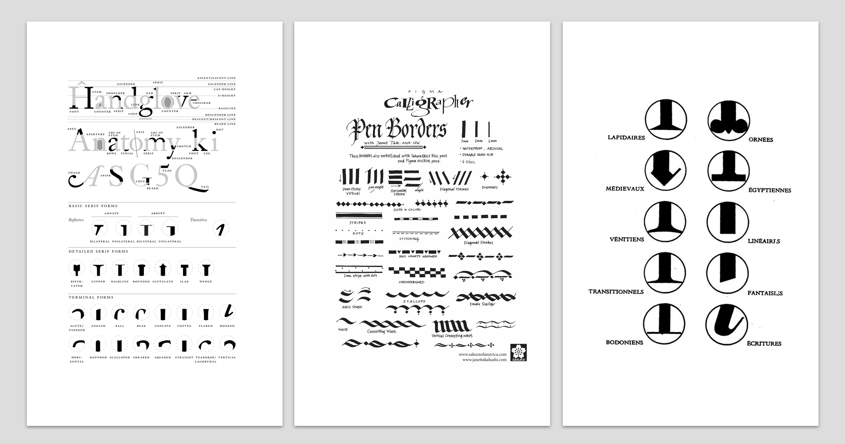
1. Type Design Research
2. Writing Exercise Exploration
3. Sketches
4. Digitalisation
5. FontLab
Feedbacks
Reflections
Further Reading
LECTURES
Week 7
- We were given our third assignment, Task 3: Type Design and Communication.
- To help us comprehend the steps we must take to create a good typeface that complies with typographic regulations.
- Mr Vinod educated us on the specifics of the instructions for this particular task and provided a few samples of how the process works.
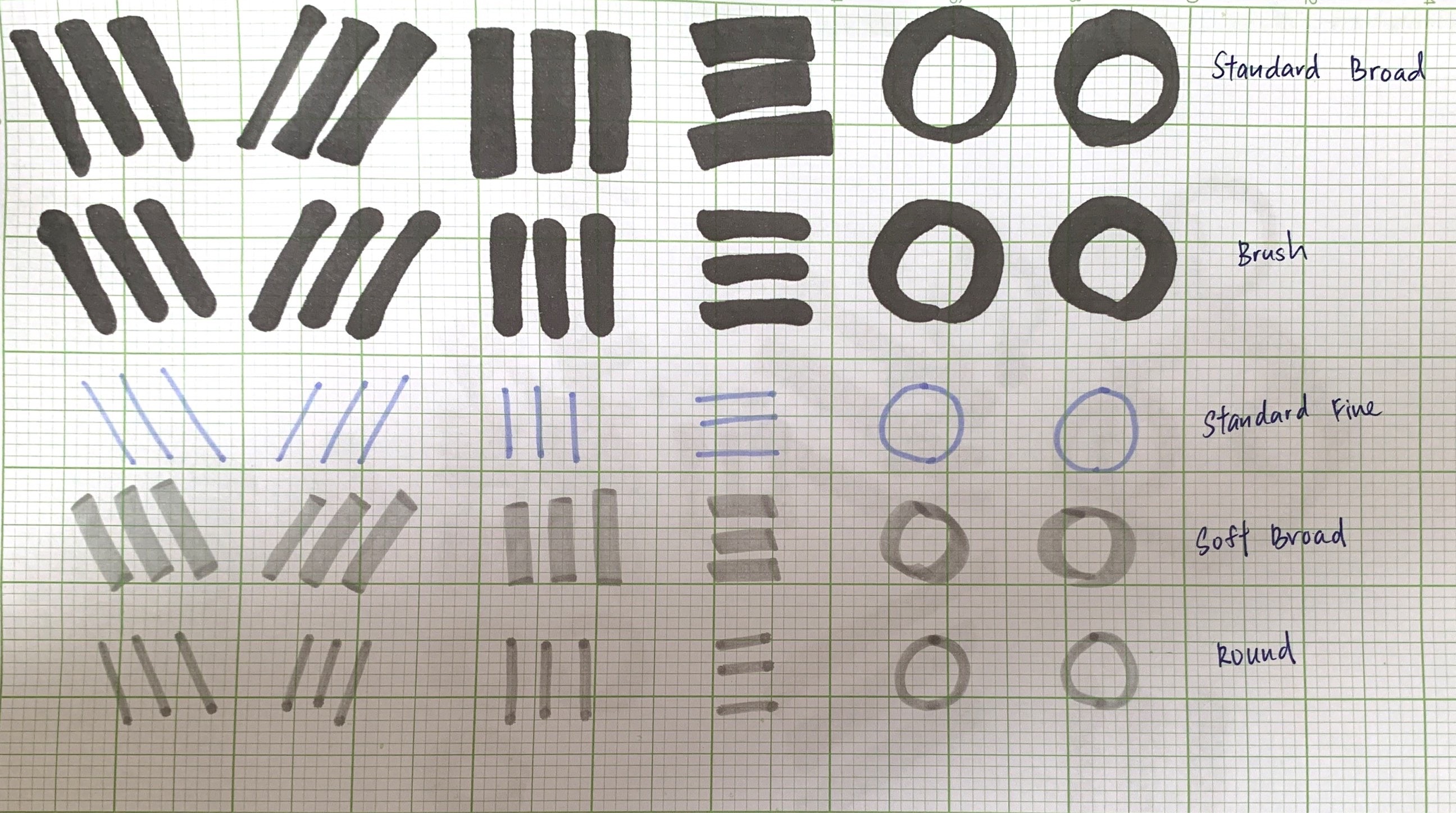
- We were told to bring graph paper and art pens.
- He asked us to bring five different writing implements and some ink so we could test which one works best for us in terms of writing and grasping the balance of handwriting.
- We had to practice writing the alphabet (A, O, T, M, X) with 5 tools in various ways.
- As soon as we finished, we had to choose one of the possibilities from each tool and write the another alphabet (A, E, T, K, G, R, I, Y, M, P, N).
- We had a choice of two ways to write these letters.

|
| Figure 1.1: Class Practices (16.05.2023- Week 7) |

|
| Figure 1.2: Class Practices (16.05.2023- Week 7) |
Week 8
Independent learning week.
Week 9
- Mr Vinod requested that we post writing exercises on Facebook last week.
- We must begin digitising this week and decide on our typeface, style from our handwriting exercises.
- Mr Vinod showed us how to digitalize letterforms and create them using Adobe Illustrator.
- Before beginning Task 3A, we must watch the associated lecture video.
Week 10
- Mr Vinod helping us to identify the flaw in our draft digitalisation typefaces.
- He went around class to check our work.
- He gave us some feedback and suggestions to improve our work.
Week 11
- After complete and refine all letters, we are required to do the next step.
- The next step is creating a poster by using the words which were given by Mr Vinod and make them to own sentences.
Week 12
- Task 3 Submission Deadline: 26 June 2023, 11:59 pm
INSTRUCTIONS
<
/>
<iframe
src="https://drive.google.com/file/d/1OMMTHvEHMZgdvp0Dc9sS0YAFX97iE9zR/preview"
width="640" height="480" allow="autoplay"></iframe>
Task 3: Type Design and Communication
1. Type Design Research
<iframe
src="https://drive.google.com/file/d/1OMMTHvEHMZgdvp0Dc9sS0YAFX97iE9zR/preview"
width="640" height="480" allow="autoplay"></iframe>

|
| Figure 1.1: Typography Anatomy |
|
| Figure 1.2: Inspiration Ideas |

|
| Figure 1.3: Inspiration Ideas |

|
| Figure 1.4: Inspiration Ideas |
2. Writing Exercise Exploration
|
|
Figure 2.1: Class Practices- First Phrase (16.05.2023- Week 7) |

|
| Figure 2.1.1: Class Practices- First Phrase (16.05.2023- Week 7) |

|
|
Figure 2.2: Writing Exercise- Second Phrase (23.05.2023- Week8) |

|
| Figure 2.2.1: First Version Practices (26.05.2023- Week 8) |

|
|
Figure 2.2.2: Second Version Practices (26.05.2023- Week 8) |
|
|
| Figure 2.3: Selected Letter (26.05.2023- Week 8) |

|
| Figure 2.3.1: Handwriting to Digitising (26.05.2023- Week 8) |
3. Sketches
Based on my research, identify the style of my fonts. Once I have a few
promising ideas, I start sketching them out to visualise how they could
work. Use simple drawings or diagrams to illustrate the key components.

|

|
| Figure 3.1: Practice a New Ideal (29.05.2023- Week 9) |


|
| Figure 3.2: Final Sketches (29.05.2023- Week 9) |
4. Digitalise
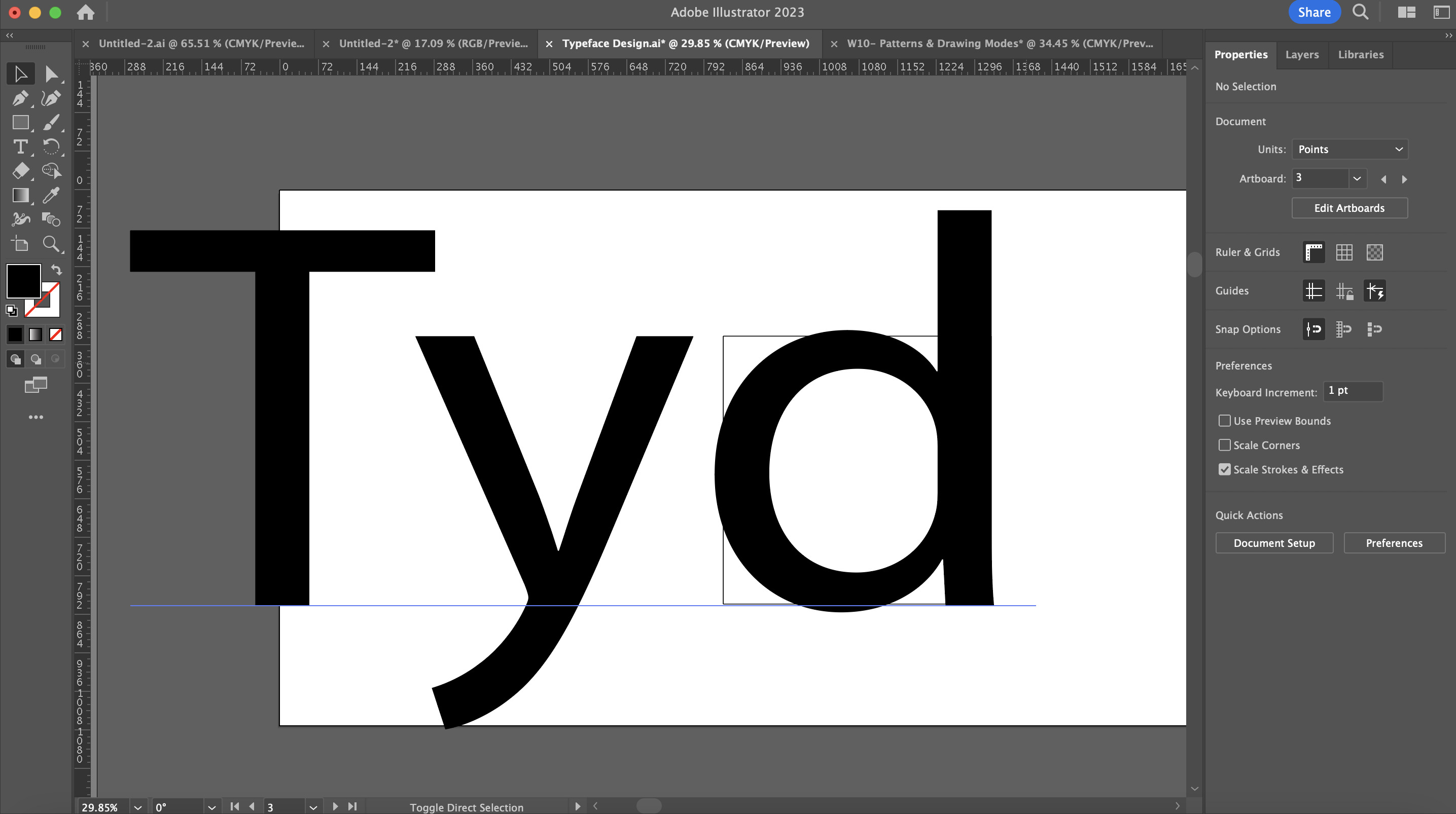
- The size of x-height has to be 500 by 500 points
- Rounded form always looks smaller because it has less surface area than a form that has a flat edge.
- The curved areas tend to overshoot the x-height of the borders of the letterform.

|
| Figure 4.1: Basic Structure (04.06.2023- Week 10) |

|
| Figure 4.2: Label all the Line in Points (04.06.2023- Week 10) |

|
| Figure 4.2.1: Typeface Outcome (11.06.2023- Week 10) |

|
| Figure 4.2.2: Typeface Outcome- Outline (11.06.2023- Week 10) |
Construction of Punctuations
After perfecting the letters, I started working on punctuations.

|
| Figure 4.3: Period & Comma Process (12.06.2023- Week 10) |

|
| Figure 4.3.1: Exclamation Mark Process (12.06.2023- Week 10) |

|
| Figure 4.3.2: Numbersign Process (12.06.2023- Week 10) |
Combining the Letterforms
I have different shapes colour on the typeface outcome ( Figure 4.2.2),
so I need to cut constitute the letterforms.
Suggestion:
- Make sure that there are no anchor points that are too close to each other.
- It doesn't really impede the process of generating the font.
- It's not a good thing to have two points too close to each other.
- Combined the letterforms using the pathfinder to the unite.
-
Cut out the counter space form the circular shapes by using either the minus
front tool or the exclude tool.

Figure 4.4: Combining the Letterforms (12.06.2023- Week 10)

Final Typeface Outcome
|
|
||
Figure 4.5: Final Typeface Outcome (12.06.2023- Week 10)
|
5. FontLab
Importing Glyphs
Process of importing the letters or rather copy pasting the letters into
various cells
- Double click the cells.
- Once the cells is open, these are as known as slide bearings.
- We can see the cap height ascender at the stated measurements that we have created.
- Going back to Adobe Illustrator and take the X and Y coordinates.
- Dragging the X and Y coordinates, placing it near the letter formula and copying it.
- The form will be exactly within the X and Y coordinates of the letterforms.

|
| Figure 5.1: Importing Glyphs (12.06.2023- Week 10) |

|
|
Figure 5.2: Testing the Outcome (12.06.2023- Week 10) |
Poster
- We need to make a poster with the fonts.
- Mr Vinod gave us free rein on what sentence we would like to put it into our poster.
- We can find the sentence online.
- It's hard because we can only use the letters (aetkgrympn.,!#) given by Mr Vinod.

|
| Figure 5.3: Process of Poster (16.06.2023- Week 11) |

|
| Figure 5.3.1: Final Poster Layout in Black & White (20.06.2023- Week 12) |
Final Task 3: Type Design & Communication
Font Download: Fennec
 |
| Figure 5.4: Final Typeface "Fennec" (JPEG) (20.06.2023- Week 12) |
< />
<iframe src="https://drive.google.com/file/d/1GXVdLu9eJWcEGnzOVdIRFT-WbyCaUJPa/preview" width="640" height="480" allow="autoplay"></iframe>
Figure 5..1: Final Typeface "Fennec" (PDF) (20.06.2023- Week 12)

|
| Figure 5.5: Final Poster (JPEG) (20..06.2023- Week 12) |
</>
<iframe src="https://drive.google.com/file/d/1ZmOHMkc5mmYDVIkYLJiJ16mimhR7c85I/preview" width="640" height="480" allow="autoplay"></iframe>
Figure 5.5.1: Final Poster (PDF) (10.06.2023- Week 12)
FEEDBACK
Week 8
General Feedback: Independent Learning Week
Specific Feedback: Independent Learning Week
Week 9
General Feedback: Absent with Permission
Specific Feedback: Absent with Permission
Week 10
General Feedback: Continue to finish the work, need to refine the
digitalise work that we have done last week.
Specific Feedback: No feedback is given on Week 10.
Week 11
General Feedback: Always watch the lecture video on the YouTube
playlist given us by Mr Vinod.
https://youtu.be/zhVCyvjK25w
Specific Feedback: Make sure the letterforms consistent stroke weight
and follow the x-height and cap height. Do more practice to identify your
typeface style.
Week 12
General Feedback: The sentences must include all the created letters.
If the poster's background is black, make sure no more than 95% in black.
Specific Feedback: The comma is too big, make it smaller.
REFLECTIONS
Experiences
After completing this assignment, I got some experiences and steps that
typically follow. The first is refinement and iteration. Once I have
completed the initial design of the typeface, I will likely go through a
process of refinement and iteration. This involves carefully examining each
character and making adjustment to ensure consistency, legibility, and
visual harmony within the typeface. I may need to make changes to
letterforms, spacing, kerning, and other typographic details. It's crucial
to test my typeface various contexts to assets its performance. This
includes testing its legibility at different sizes, evaluating its
readability in different mediums, and examining how it interacts with
different languages or writing systems if applicable. Testing helps me to
identify any issues or improvements needed to enhance the typeface's
usability.
Obversations
- Legibility: Assess the legibility of the typeface across different sizes and contexts. Check if the letterforms are clear and distinguishable, especially in small sizes or low- resolution settings.
- Readability: Evaluate how easily the typeface can be read when used in longer bodies of text. Consider factors such as letter spacing, line spacing, and the overall rhythm of the text.
- Glyph Set: Review the glyph set to ensure it covers all necessary characters, punctuation marks, and symbols required for the desired language or typographic needs. Make sure that there are no missing or incorrectly designed glyphs.
Findings
The key of a typeface refers to its unique visual characteristics and design elements. It encompasses factors such as the shape, style, weight, width, and proportions of the individual letterforms. The key of a typeface can influence its overall aesthetic, legibility, and readability. Script typefaces mimic handwritten or calligraphic styles, and they are often used for artistic or decorative purposes. They can vary significantly in their key, ranging from elegant and flowing scripts to ore playful and informal styles. Examples of script typefaces include Brush Script, Pacifico, and Snell Roundhand.
FURTHER READINGS

What is the difference between fonts vs typefaces?
Main difference: the former exists as part of the latter
Example: We'll take Helvetica. Often referred to as a 'font', Helvetica is actually a typeface. It's complete set of sans serif characters with a common design ethos. The typeface also comprises a collection of fonts at the same time.
In certain contexts...- not just when you're talking to a typographer who is a stickler for accuracy.
- knowing the exact font is critical.
- Example: coding an app for a specific type of display, adhering to a particular font selection may lead to optimum legibility.
-Brand guidelines: choosing typefaces in certain sizes and weights to support the brand aesthetic they want to portray.
- not just when you're talking to a typographer who is a stickler for accuracy.
- knowing the exact font is critical.
- Example: coding an app for a specific type of display, adhering to a particular font selection may lead to optimum legibility.
-Brand guidelines: choosing typefaces in certain sizes and weights to support the brand aesthetic they want to portray.
"It's probably sacrilege but I'm not sure I've ever known the difference"
Dave Sedgwick, founder of Studio DBD in Manchester-------------------------
The terms 'font' and 'typeface' are often used interchangeably. Most clients probably don't know the difference either. So, we just present directly with simple, straightforward terminology ways to them.

Comments
Post a Comment