Typography / Task 2: TYPOGRAPHY EXPLORATION & COMMUNICATION
03.05.2023 - 23.05.2023 / Week 5-Week 8
Chai Wan Sin / 0363470
Typography / Bachelor of Design (Honours) in Creative Media
Task 2: Typography Exploration & Communication
Chai Wan Sin / 0363470
Typography / Bachelor of Design (Honours) in Creative Media
Task 2: Typography Exploration & Communication
INDEX
1. Lectures
2. Instruction / Task 2: Typographic Exploration & Communication
3. Feedback
4. Reflections
5. Further Reading
LECTURES
Week 6
- Mr Vinod gave us some suggestions and feedback to improve our work.
- Mr Vinod showed us some examples of the headline expression.
- He also showed us that what we need to include in our blog.
Week 7
- Mr Vinod need us to post our Task 2 Editorial Layout on Facebook and he won't be giving us feedback this week.
- Task 2 submission dateline: 26.05.2023.
- Mr Vinod gave us an exercises. He asked us to use 5 different nibs for writing in class.
- Different nibs: Calligraphy, Semi-Broad, Super Fine, Standard Fine, Brush, Round and etc.
INSTRUCTIONS
< />
<iframe src="https://drive.google.com/file/d/1OMMTHvEHMZgdvp0Dc9sS0YAFX97iE9zR/preview" width="640" height="480" allow="autoplay"></iframe>
Task 2: Project 1 - Typographic Exploration & Communication (Text
Formatting and Expression)
- We are required to download Task 2 Editorial option and layout the research and references.
- Identifying text in a layout and measuring the amount of space used.
- Thumbnail Sketches.
- Out of the three editorial text options, we will select one.
- My theme of choice: Unite to Visualise a Better World
- We are requested to use InDesign with two 200mm x 200mm pages and the 10 fonts given.
- Minimized for graphic elements.
1. Research
 |
| Figure 1.1: References and Ideas from Pinterest (04.05.2023- Week 5) |
 |
| Figure 2.2: Sketches #2 (05.05.2023- Week 5) |
 |
| Figure 2.3: Sketches #3 (05.05.2023- Week 5) |
 |
| Figure 2.4: Sketches #4 (05.05.2023- Week 5) |
The first sketch, which I believe is the greatest. Then I started digitalised them to create a final layout.
3. Headings Expression Explorations
Final Text Formatting Layout
Head Fonts:
Specific Feedback: Let the word in same line length and the paragraph spacing not to too big.
Week 7 General Feedback: It is advised against using the Bodoni font in body text. Doing more practise should be made with typeface sketches when conducting research.Specific Feedback: No feedback is given in Week 7.
Experience I have applied that you should finish your sketching before beginning the entire task. It will efficiently guides me through my digitalizations work. I also made an effort to get some input from my peers on my work. I thought it worked really well, and they provided a lot of good advice.
Observations Doing design work is a multifaceted process that combines creativity, technical skills, problem- solving, and collaboration. It requires a blend of artistic vision, analytical thinking, and the ability to adapt to changing requirements. Designers continually strive to create visually appealing and functional solutions that effectively communicate messages.
Findings I found out that we need to doing more research and thoroughly understanding the problem they are trying to solve. This involves conducting research, gathering insights, and empathising with the users ,readers or target audience. The better problem is to understood, the most effective and relevant the design solutions will be.
The Typographic Grid
#1. They should be connected to one another or in a circle if possible. So, I tried making it in a curve.
 |
| Figure 3.1: Headings Expression Explorations #1 (06.05.2023- Week 6) |
#2. All I want in Layout 2 is I want to put the font together like a puzzle.
 |
| Figure 3.2.1: Searching |
One continuous line drawing of two young businessmen push puzzle pieces to unite them as sign to start business collaboration.
 |
| Figure 3.2.2: Headings Expression Explorations #2 (06.05.2023- Week 6) |
#3. I am using different typeface for the headline to present the word, I magnify the word world.
 |
| Figure 3.3: Headings Expression Explorations #2 (06.05.2023- Week 6) |
#4. I disassembled the font, and put the sub-heading in the centre to embellish it.
 |
| Figure 3.4: Headings Expression Explorations #3 (06.05.2023- Week 6) |
4. Layouts
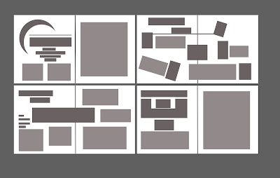
 |
| Figure 4.3: Text Formatting Layout #3 (08.05.2023- Week 6) |
 |
| Figure 4.4: Text Formatting Layout #4 (08.05.2023- Week 6) |
Modification
 |
| Figure 4.6.1: Final Text Formatting Layout #1 (08.05.2023- Week 6) |
- Futura- Condensed ExtraBold (Unite to Visualise a Better)
- Bodoni 72- Bold (WORLD)
Type Size:
- 48 pt (Unite to Visualise a Better)
- 150 pt (WORLD)
Tint: 100% (head), 10% (background)
Sub- head
Fonts: Futura Std- Bold
Type Size: 14 pt
Body
Fonts: Gill Sans- Regular
Type Size: 12 pt
Leading: 14.4 pt
Paragraph Spacing: 14.4 pt
Alignment: Left Justified
Margins: 5mm (Top, Bottom, Left, Right)
Columns: 1
Gutter: 4.233mn
Figure 5.1.1: Final Layout with Grids- PDF (16.05.2023- Week 7)
 |
| Figure 5.2: Final Layout with Grids- JPEG (16.05.2023- Week 7) |
< />
<iframe src="https://drive.google.com/file/d/1lshZaFqUcgis_xJgZYF9Aq0DU4AJFlaD/preview" width="640" height="480" allow="autoplay"></iframe>
Figure 5.2.1: Final Layout with Grids- PDF (16.05.2023- Week 7)
FEEBACK
Week 6
General Feedback: Doing the work simple but not simplistic, maximum 65-75 words in one line. Headline is important, make it clear. Using the given size and use the format correctly.
REFLECTION
FURTHER READING
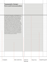
- A grid is a skeletal framework used by designers to organise their information within a spatial field.
- It is a system characterised by the dualities of freedom and constraint, simplicity and complexity.
- It provides a strategy for composing text and other visual information in 2 & 3 dimensional space.
- Grid systems aid designers in making information clear and optimally accessible.
- Typographic grids provide form and space with proportional harmony and aesthetic beauty and the final result is clearer and more accessible communication.
Structure & Space
- Space: the common denominator for all typographic communication.
- They will create subliminal divisions, and these division create spatial structure, when typographic elements are introduced into space.
- Way of thinking about type and its relationship: to imagine a letterform as point in space, the extension of a point as line in space (line of text), and the extension of a line as a plane in space (text block).
- Suggestion: Typographic elements are kinetic in nature, that they are in perpetual motion.
- We are more comfortable with the horizontal- in this realm we feel safe. The vertical dimension is more challenging- we are afraid both of flying and of falling.
 |
Figure 6.1:Sample multicolumn grids ranging |
- Grids allow for the distribution of typographic elements into a clearly intelligible order.
- Within the internal structure created, headlines, text, captions, images, and other parts of the message are integrated.


Comments
Post a Comment