Digital Photography & Imaging
03.04.2023- 08.05.2023 / Week1- Week4
Chai Wan Sin / 0363470
Digital
Photography and Imaging / Bachelor of Design (Honours) in Creative Media
Project
1 / Exercises
LECTURES
Week 1
- We received a quick introduction to composition research from Mr Fauzi.
- By practising composition, we can eventually apply these concepts to our daily lives or design work
- The following assignment required us to select three of our favourite graphic design composition work from Pinterest.
- Describe what the graphic design composition works want to convey to the reader and explain why do I like the designs.
1. The Basic of Composition
- Focal Point: A key element to any good composition, as it helps your viewers' eyes naturally settle on the important pieces of your design first.
- Scale & Hierarchy: Scale is often used to help communicate hierarchy by drawing attention forward and away from certain elements.
- Balance The Elements: Mastering asymmetrical balance is to think of each element as having a 'weight' to it. Smaller object might 'weight' less than larger objects, and heavily textured elements might 'weight' more than flatly colored elements.
- White Space: Mostly known as "empty space" to balance up the main focus of a composition. Help boost your design's clarity and overall look by balancing out the more complicated.

|
| Figure 1.1: Example of White Space |

|
| Figure 1.2: Example of White Space |
2. Rule of Thirds
- The process of dividing an image into thirds using two horizontal and two vertical lines.
- This imaginary grid yields nine parts with four intersection points.

|
| Figure 1.3: Rules of Third, Week 2 (10.04.2023) |
- When you position the most important elements of your image at these intersection points, you produce a much more natural image.
- It is also suggested that any horizon is placed on either the top horizontal line or bottom horizontal line.
Way:
- Use composition techniques that are in line with what's naturally pleasing to the eye.
- Creatively use negative space.
- Create conversation between the subject and background.
3. Golden Ratio
- A mathematical ratio.
- It is commonly found in nature, and when used in a design, it fosters organic and natural- looking compositions that are aesthetically pleasing to the eye.

|
| Figure 1.4: Golden Ratio, Week 2 (10.04.2023) |
- The Gold Ratio boils down to aesthetics- creating and appreciating a sense of beauty through harmony and proportion.
- When applied to design, the Golden Ratio provides a sense of artistry.
- The Golden Ratio is a useful guideline for determining dimensions of the layout.
- The Golden Ratio is to set your dimensions to 1:1.618.

|
| Figure 1.5: Example of The Golden Ratio |
4. Composition [Framing & Cropping]
Week 3
Introduction to Adobe Photoshop 2023
1. Lasso Tool:
- Allow to draw and pinpoint specific areas of a document.
- Three different tool option: Lasso, Polygonal Lasso, Magnetic Lasso.
- Similar to a pencil.
2. Pen Tool:
- The most common option.
- Add these points and the way you drag the tool as you create the points determines how they will look.
- The fewer points, the smoother a path will be.
- Variation of Pen Tool:
- Straight line paths
- U shaped curves
- Simple S curves
- Complex S curves
3. Layering :
- Different images stacked on top of each other.
- Use layers for non- destructive editing.
- Never destroyed the original image.
Week 4
4. Adjustment Layer :
- In Photoshop are a group of a super useful, non- destructive image editing tools.
- Can edit and discard your adjustments or restore your original image at any time.
- Make your workflow in Photoshop more flexible and efficient, and is an absolute must- know.
- Brightness / Contrast: Makes adjustments to the tonal range of your images. Adjusting the highlights and the shadows.
- Level: Adjusting the levels of the shadows, midtowns, and highlights.
- Curves: Adjusting as many points as you want throughout the entire tonal range of your image. The most powerful and precise tool for editing the tones in an image.
- Exposure: Adjusting exposure levels with three sliders: Exposure, Offset and Gamma.
- Selective Color: Adjustment layer selectively modifies the amount of a primary color without modifying the other primary colours.
5. Filters :
- Edit photos is an essential element of Adobe's graphics editor.
- Change colour, add blur or create completely new image effects.
INSTUCTIONS
< /
<iframe src="https://drive.google.com/file/d/1SO5E9vGtc6qUYXj5_Cng65f2CHQsJv2m/preview" width="640" height="480" allow="autoplay"></iframe>
TASKS
Exercise
- List down three favourite graphic design composition work from Pinterest.
- Explain why do you like the designs on the E-portfolio blog.
Design# 1: https://pin.it/ZyIvuQ0
Project 1
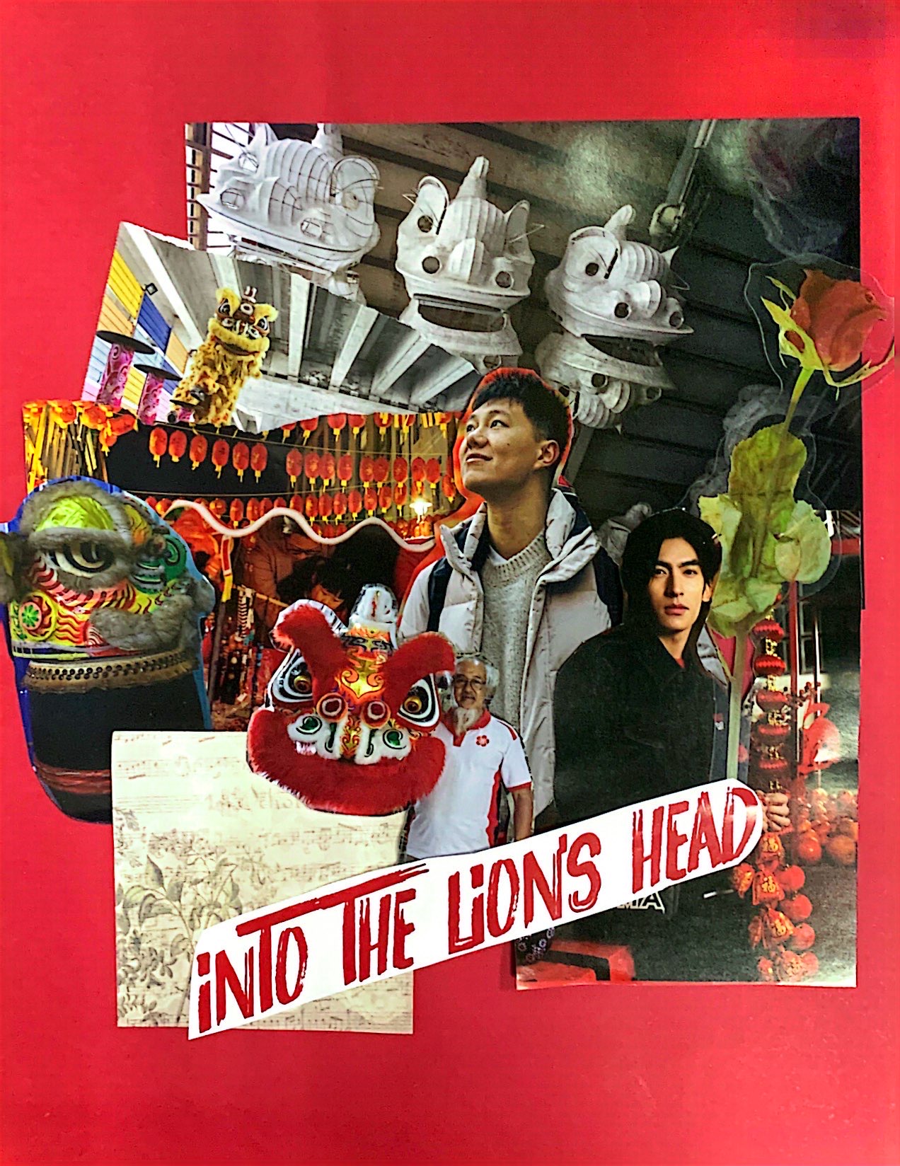
Project 1A: Physical Collage
- In order to practise compositions without utilising digital tools, we are making collages physically.
- I experimented with collage using some magazine cutouts.

|
| Figure 2.2: Third Attempt of Physical Collage |

|
| Figure 2.1: Second Attempt of Physical Collage |
- Mr Fauzi select the first collage.
|
| Figure 2.3: First Attempt of Physical Collage |
Project 1B: Digital

Comments
Post a Comment