Typography / Task 1: TYPE EXPRESSION & TEXT FORMATTING
04.04.2023- 02.05.2023 / Week 1-Week 5
Chai Wan Sin / 0363470
Typography / Bachelor of Design (Honours) in Creative Media
Task 1: Exercises1 & 2
INDEX
1. Lectures:
Week 1: Introduction and Development
Week 2: Basic
Week 3: Text Part 1
Week 4: Text Part 2
Week 5: Understanding
Week 6: Screen and Print
2. Instruction / Task 1
Exercise 1: Type Expression
Exercise 2: Formatting Text
3. Feedback
4. Reflections
5. Further Reading
LECTURES
Week 1 / Introduction & Briefing Task 1
- Mr Vinod requested that we join the Typography Module group on Facebook so that we may receive any upcoming updates and information in fine detail.
- Mr Vinod gave an introduction to the E-portfolio and instructed us to view the video on YouTube training video before creating our own.
- In the first work, we had to select four words from a list of seven and then either digitally or manually paint them.
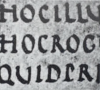
Typography 0: Introduction
Typography:
- The art and technique of arranging type to create visually appealing and legible text.
- Choosing typefaces, point sizes, line spacing (leading), letter spacing (tracking), and altering the distance between letter pairs are all part of the type arrangement process.
- Type design is a closely related craft that is occasionally regarded to be a part of typography.
- Understanding the anatomy of typography is crucial for graphic designers, web designers, and anyone working with text.
- Be employed as a decorative and aesthetic tool that has nothing to do with conveying information.
- The practise of arranging words, letters, numbers, and symbols for publication, display, or distribution.
- The work of typesetters (also known as compositors), typographers, graphic designers, art directors, manga artists, comic book artists, and, as of late, anyone who self-publishes materials.
 |
| Figure1.1: Calligraphic Blackletter |
The Basic Terminology :
Typeface: A set of characters, including letters, numbers, and symbols, that share a common design or style.
Font: A specific size, weight, and style of a typeface.
 |
| Figure1.2: Example of Font |
Typography 1: Development
The Evolution of the Alphabet
Language changes with time. Language, typography, and letters all evolve and change over time. This continuing change that has been developing over the past few thousand years led to the contemporary English alphabet that we are all accustomed.
 |
| Figure1.3: Evolution of the Alphabet |
- The "A" was originally a Cretan pictograph representing an ox's head.
- The Cretan pictographs were transformed by the Phoenicians into the first alphabet. (The Phoenician Alphabet)
- They wrote from right to left, and the symbol was flipped around.
- The letterform was formerly more polished and rotated since Greeks often wrote from left to right.
- The character was finally turned upright by the Romans, giving it the shape we are familiar with today.
Cuneiform Tablets :
- Writing in the past involved scratching into wet clay with a sharpened stick or cutting with a chisel onto stone.
- The earliest standardised writing system, developed in ancient Mesopotamia as early as 4000 BC.
 |
| Figure1.4: Example of Cuneiform Tablets |
First Letterform Development : Phoenician to Roman
Phoenician Alphabet :
- Developed from the Proto-Cnaanite alphabet, during the 15th century BC.
- Before the the Phoenicians wrote with a cuneiform script.
 |
| Figure1.5: Phoenician Votive Stele Carthage |
 |
| Figure1.6: The Evolution of the Phoenician Script into Modern Latin and Arabic |
Greek Alphabet :
- The Greeks adopted the characters of the Phoenician alphabet.
- Early Greek Style: Written in boustrophedon style where each alternating line actually read in opposite directions.
- Boustrophedon style writing meant that the lines of text read alternately from right to left and left to right.
 |
| Figure1.7: Writing of Boustrophedon Style |
Etruscan Alphabet :
- Derived from a Greek alphabet (originally learned from the Phoenicians).
- Etruscan carvers working in marble painted letterforms before inscribing them.
- Strokes change in weight from vertical to horizontal, a broadening of the stroke at start and finish-carried over into the carved letterforms.
 |
| Figure1.8: Example of Etruscan Writing |
Roman Alphabet :
- The 26- letter alphabet that is still in use today was created from the roman alphabet.
 |
| Phoenician Greek Roman 1000 B.C.E. 900 B.C.E. 100 B.C.E Figure1.9: Development of Letterforms |
Hand Script from 3rd- 10th century C.E.
Square Capitals :
- The most official literature and documents were almost always written in this style.
- The written version that can be found in Roman monuments.
- These letterforms have serifs added to the finish of the main strokes.
- The variety of stroke width was achieved by the reed pen held at an angle of approximately 60 degree off the parpendicular.
 |
| Figure1.10: 4th or 5th century Square Capitals |
Rustic Capitals :
- The writing was done in a narrow letterform that took less time to draw and took up less space.
- Rustic capitals were faster and easier to, they were slightly harder to read due to their compressed nature.
- The pen or brush was held at an angle of approximately 30 degree off the perpendicular.
 |
| Figure1.11: Late 3rd- mid 4th century Rustic Capitals |
- The word "cursive" in Latin meant "running", so the forms were simplified for speed.
- The beginning of lowercase letterforms.
 |
| Figure1.12: 4th century Roman Cursive |
- Incorporated Roman cursive hand.
- Think of uncials simply as small letters.
- The broad forms of uncials are more readable at small sizes than rustic capitals.
 |
| Figure1.13: 4th- 5th century Uncials |
Half- uncials :
- The formal beginning of lowercase letterforms.
 |
| Figure1.14: C.500 Half-uncials |
Caroline minuscule :
- Charlemagne, the first unifier of Europe since the Romans, issued an edict in 789 to standardise all ecclesiastical text.
- The monks rewrote the texts using both majuscule (uppercase), minuscule, capitalisation and punctuation which set the standard for calligraphy for a century.
 |
| Figure1.15: C.925 Caroline minuscule |
Blackletter to Gutenberg's Type
- Textura : Strongly vertical letterform know as Blackletter or textura gained popularity (in Northern Europe).
- Rotunda: A rounder more open hand gained popularity. (in Southern Europe)
 |
| Figure1.16: C.1300 Blackletter |
Gutenberg's style:
- Skills included engineering, metalsmithing, and chemistry.
- Build pages that accurately mimicked the work of the scribe's hand- Blackletter of Northern Europe.
- Type mold required a different brass matrix, or negative impression, for each letterform.
 |
| Figure1.17: C.1455 42 line bible, Johann Gutenberg, Mainz |
Typeface Classification
- 1450 Blackletter: The oldest typefaces - based on the hand-copying styles used in books in Northern Europe at the time. (exp: Cloister Black, Goudy Text)
- 1475 Oldstyle: Includes the first Roman types, based on the lowercase forms used by Italian humanist scholars for book copying and the uppercase letterforms found inscribed on roman ruins. (exp: Bembo, Carson, Dante, Garamond, Janson, Jenson, Palatino)
- 1500 Italic: Condensed and close-set (now not considered as a separate typeface)
- 1550 Script: An attempt to replicate engraved calligraphic forms. (exp: Kuensitler Script, Mistral, Snell Roundhand)
- 1750 Transitional: A refinement of old style forms- think and thin relationships were exaggerated, and brackets were lightened. (exp: Baskerville, Bulmer, Century, Time Roman)
- 1775 Modern: Serifs are unbracketed, and the contrast between thick and thin are extreme. (exp: Bell, Bodoni, Caledonia, Didot, Walbaum)
- 1825 Square Serif / Slab Serif: Have very heavy serifs with minimal or no bracketing. (exp: Clarendon, Memphis, Rockwell, Serita)
- 1900 Sans Serif: Eliminated serifs.
- 1990 Serif / Sans Serif: Includes both serif and sans serif alphabets. (exp: Ross, Scala, Stone)
 |
| Figure1.18: Timeline- History of Sans Serif Typefaces |
Week 2 / Digitalisation
- Mr Vinod displays some of his prior work to us.
- He reviewed some student's work and offered numerous recommendations for our sketches.
- He advised us to avoid using too much graphics in our sketches.
- The four final words that we had sketched last week must be converted to digital form.
Typography 2: Basic
- Learn the basics of the letters and their components from the anatomy of typography.
- Additionally, it aids in our understanding of the basic principles behind various design.
- Many typefaces and fonts out there are so similar that it won't be easy to tell them apart between Times New Roman and Gothic typefaces.
- Becoming a successful typographer or designer- not to mention a master of kinetic typography - is to comprehend the fundamental ideas and anatomy of typography.
Basic Anatomy
- Baseline: The imaginary line the visual base of the letterforms.
- Median: The imaginary line defining the x-height of letterforms.
- X-height: The height in any typeface of the lowercase 'x'.
 |
| Figure1.19 |
- Stroke: Any line that defines the basic letterform.
 |
| Figure1.20 |
- Apex / Vertex: The point created by joining two diagonal stems. (apex above and vertex below)
 |
| Figure1.21 |
- Arm: Short strokes off the stem of the letterform, either horizontal ( E, F, L) or inclined upward ( K, Y)
 |
| Figure1.22 |
- Ascender: The portion of the storm of a lowercase letterform that projects above the median.
 |
| Figure1.23 |
- Barb: The half-serif finish on some curved stroke.
 |
| Figure1.24 |
- Bowl: The rounded form that describes a counter. The bowl may be either open or closed.
 |
| Figure1.25 |
- Bracket: The transition between the serif and the stem.
 |
| Figure1.26 |
- Cross Bar: The horizontal stroke in a letterform that joins two stems together.
 |
| Figure1.27 |
- Crotch: The interior space where two strokes meet.
 |
| Figure1.28 |
- Ear: The stroke extending out from the main stem or body of the letterform.
 |
| Figure1.29 |
- Em/ En: Originally referring to the width of an uppercase M, and em is now the distance equal to the size of the typeface ( an em in 48 points, for example). An en is half the size of an em.
 |
| Figure1.30 |
- Ligature: The character formed by the combination of two or more letterforms.
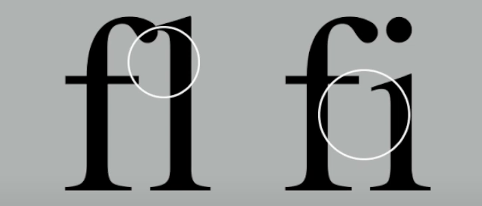 |
| Figure1.31 |
- Link: The stroke that connects the bowl and the loop of a lowercase g.
 |
| Figure1.32 |
- Serif: The right- angled or oblique foot at the end of the stroke.
 |
| Figure1.33 |
- Shoulder: The curved stroke that is not part of a bowl.
 |
| Figure1.34 |
- Spine: The curved stem of the S.
 |
| Figure1.35 |
- Spur: The extension the articulates the junction of the curved and rectilinear stroke.
 |
| Figure1.36 |
- Stem: The significant vertical or oblique stroke.
 |
| Figure1.37 |
- Stress: The orientation of the letterform, indicated by the thin stroke in round forms.
 |
| Figure1.38 |
- Swash: The flourish that extends the stroke of the letterform.
 |
| Figure1.39 |
- Tail: The curved diagonal stroke at the finish of certain letterforms.
 |
| Figure1.40 |
- Terminal: The self- contained finish of a stroke without a serif, it may be flat ('T' above), flared, acute, ('t' above), grave, concave, convex, or rounded as a ball or a teardrop (see final).
 |
| Figure1.41 |
The Font
The full font of a typeface contains much more than 26 letters, to numerals, and a few punctuation marks.
Uppercase Letters :
Capital letters, including certain accented vowels, the c cedilla and n tilde, and a/ e and o/ e ligatures.
 |
| Figure1.42: Example of Uppercase Letters |
Lowercase Letters :
Including the same characters as uppercase.
 |
| Figure1.43: Example of Lowercase Letters |
Small Capitals :
- Uppercase letterforms draw to the x- height of the typeface.
- Primarily found in serif fonts as part of what is often called expert set.
 |
| Figure1.44: Example of Small Capitals |
 |
| Figure1.45: Small Capitals letter vs Lowercase letter |
Uppercase Numerals :
- Also called lining figures.
- These numerals are the same height as uppercase letters.
- All set to the same kerning kidth.
- Most successfully used with tabular material or in any situation that calls for uppercase letters.
 |
| Figure1.46: Example of Uppercase Numerals |
Lowercase Numerals :
- Also known as old style figures or text figures.
- These numerals are set to x- height with ascenders and descenders.
- Best used when ever using upper and lowercase letterforms.
- Far less common in sans serif type- faces than in serif.
 |
| Figure1.47: Example of Lowercase Numerals |
Italic :
- Most fonts are produced with a matching italic.
- The form in a italic refer back to fifteenth century Italian cursive handwriting.
- Oblique are typically based on the roman form of the typeface.
 |
| Figure1.48: Example of Italic |
 |
| Figure1.49: Italic vs Roman |
Punctuation, Miscellaneous Characters :
- Can change from typeface to typeface.
- It's important to be acquainted with all the characters available in a typeface before choosing the appropriate type for a particular job.
 |
| Figure1.50: Example of Punctuation, Miscellaneous Characters |
Ornaments :
- Used as flourishes in invitations or certificates.
- They usually are provided as a font in a large typeface family.
- A few traditional or classical typefaces contain ornamental fonts as part of the entire typeface family (Adobe Caslon Pro).
 |
| Figure1.51: Example of Ornaments |
Describing Typefaces
- Roman: The uppercase forms are derived from inscriptions of Roman monuments. A slightly lighter stroke in roman is known as 'Book'.
- Italic: Named for fifteenth century Italian handwriting on which the forms are based. Oblique conversely are based on roman form of typeface.
- Boldface: Characterised by a thicker stroke than a roman form. It can also be called 'semibold', 'medium', 'black', 'extra bold', or super.
- Light: A lighter stroke than the roman form. Even lighter strokes are called 'thin'.
- Condense: A version of the roman form, and extremely condensed styles are often called 'compressed'.
- Extended: An extended variation of a roman font.
 |
| Figure1.52: Example of Describing Typefaces |
Comparing Typefaces
- The 10 typefaces mentioned represent 500 years of type design.
- Two goals: easy readability and an appropriate expression of contemporary aesthetics.
- As a beginning typographer, you should study these ten faces carefully and develop your skill in your design programme. Once you understand how to use these faces approximately and effectively, you'll be well prepared to understand and appreciate other typefaces as you encounter them.
 |
| Figure1.53: 9 Typefaces use for further exercises |
Comparing Typefaces
- The accumulation of choices that readers each unique.
- Beyond the gross differences in x-height, the forms display a wealth of variety, in line weight, relative stroke widths and in feeling. Typographer can't feel the specific use and expression.
- The Rs display a range of attitudes, some whimsical, stately and mechanical.
- Others calligraphic some harmonious and some awkward.
 |
| Figure1.54: Example of Comparing Typefaces |
Week 3 / Animation
- By observing Youtube's fundamental animation tutorials, we must select one or more digitalised words and turn them into animations.
- For the purpose to demonstrate the effectiveness of our work, we had to screenshot the entire procedure.
Typography 3 / Part 1: Text
Tracking- Kerning & Letterspacing
- Kerning: The automatic adjustment of space between letters.
- kerning of letter spacing option+ left arrow key (maximum 1-3)
 |
| Figure1.55: Example of With or Without Kerning |
- Letterspacing: Adding space between the letters.
- Tracking: Additional and removal of space in a word or sentence.
- Normal tracking, Loose tracking and Tight tracking
| Figure1.56: Example of Tracking |
Formatting Text
- Flush Left: Each line starts at the same point and ends where the word before it does. Spaces between words are consistent, allowing the type to create an even gray value.
 |
| Figure1.57: Example of Flush Left |
- Centered: Imposes symmetry upon the text, assigning equal value and weight to both ends of any line.
 |
| Figure1.58: Example of Centered |
- Flush Right: Emphasis on the end of a line as opposed to its starts. Useful in situation (like captions) where the relationship between text and image.
 |
| Figure1.59: Example of Flush Right |
- Justified: Like entering, imposes a symmetrical shape on the text. Achieved by expanding or reducing spaces between words.
 |
| Figure1.60: Example of Justified |
- Designers tend to set type one way or another depending upon several factors, personal preference, prevailing culture and the need to express play important roles.
- Keep in mind the typographer's first job- clear, appropriate presentation of the author's message.
- Different typefaces suit different messages.
- A good typographer has to know which typeface best suits the message at hand.
- Type with a relatively generous x- height or relatively heavy stroke width produces a darker mass on the page than type with a relatively smaller x-height or lighter stroke.
- Sensitivity to these differences in colour is fundamental for creating successful layouts.
 |
| Figure1.61: Anatomy of a Typeface |
Leading and Line Length
- Type Size: Text type should be large enough to be read easily at arms length.
- Leading: Text that is set too tightly encourages vertical eye movement. A reader can easily loose his or her place. Type that is set too loosely creates striped patterns that distract the reader from the material at hand.
.png) |
| Figure1.62: Example of tight leading and loose leading |
 |
| Figure1.63: Differences of Leading |
- Line Length: Appropriate leading for text is as much as a function of the line length as it is a question of type size and leading. A good rule of thumb is to keep line length between 55-65 characters.
Type Specimen Book
- Shows samples of typefaces in various different sizes.
- Provided an accurate reference for type, type size, type leading, type line length, etc.
- Often useful to enlarge type to 400% on the screen to get a clear sense of the relationship between descenders on one line and ascenders on the line below.
Week4
- Mr Vinod gives us some feedback and suggestions about animation.
- We had some time to polish our artwork and make last minute changes to the animation of the words.
- Then, Mr Vinod explained the following task to us: Text Formatting.
Typography 4 / Part 2: Text
Indicating Paragraphs
1. Pilcrow (¶):
- A symbol that is available in most typeface.
- Used in set in text to indicate paragraph previously.
- A holdover from medieval manuscripts seldom use today.
2. Line Space :
- Leading is larger than the typeface (usually 2.5-3 points).
- If the line space is 12pt, the paragraph space is 12pt.
- This ensures cross- alignment across columns of text.
 |
| Figure1.64: Example of Line Space |
- Mr Vinod showed us the usage of the leading and the point size text.
 |
| Figure1.65: Example of Leading and the Point Size Text |
 |
| Figure1.66: Line Space vs Leading |
3. Standard Indentation :
- The indent is the same size of the line spacing or the same as the point size of text.
- Saving space.
- Whenever using indentation, should never use left alignment and raging on the right.
- Best use when the text is justified.
 |
| Figure1.67: Example of Standard Indentation |
4. Extended Paragraphs :
- Creates unusually wide columns of text.
- Reason for choosing it: strong compositional or functional.
- This is used in academic writing, but generally not in any context.
 |
| Figure1.68: Example of Extended Paragraphs |
- Windows: As short line of type left alone at the end of a column of text.
- Orphans: A short line of type left alone at the start of new column.
- In good typography we basically avoid that, we try to bring down another word to ensure that isn't a word at the end of that particular paragraph.
- Make sure no column of text starts with the last line of the preceding paragraph.
 |
| Figure1.69: Example of Windows and Orphans |
Highlighting Text
- Different kinds of emphasis require different kinds of contrast.
1. Same Typefaces ( Italic/ Bold/ Colour)
 |
| Figure1.70: Example of Highlighting Text (Italic/ Bold) |
 |
| Figure1.71: Example of Highlighting Text (Colour) |
2. Different Typefaces
- Reduce the point size of that number by 0.5, so won't make it stand out or stick up.
 |
| Figure1.72: Example of Different Typefaces |
3. Placing a Field of Colour
- Take note.
- Maintaining the left reading axis (right example) of the text ensures readability is at its best.
 |
| Figure1.73: Example of Placing a Field of Colour |
4. Quotation Bullets
- Place it outside the left margin of a column of type (extending as opposed to indenting) to maintain a strong reading axis.
 |
| Figure1.74: Example of Place certain typography elements |
5. Quotation Marks
- Like bullets, can create a clear indent, breaking the left reading axis.
- Compare the indented quote at the top with the extended quote at the bottom.
 |
| Figure1.75: Example of Quotation Marks |
Headline within Text
- There are many kinds of subdivision within text of a chapters.
A head :
- Indicates a clear break between the topics within a section.
- A heads are larger than the text, in small caps and in bold.
- A head 'extended' to the left of the text.
 |
| Figure1.76: Example of A head |
B head :
- Subordinate to A heads.
- Indicate a new supporting argument or example for the topic at hand.
- They should not interrupt the text as strongly as A heads do.
- B head are shown in small caps, italic, bold serif, and bold san serif.
 |
| Figure1.77: Example of B head |
C head :
- Not common, highlight specific facets of material within B head text.
- Not materially interrupt the flow of reading.
- As with B heads, C heads are shown in small caps, italic, serif bold and san serif bold.
- Configuration are followed by at least an em space for visual separation.
 |
| Figure1.78: Example of C head |
- Hierarchy: Putting together a sequence of subheads.
- There is no single way to express hierarchy within text; in fact the possibilities are virtually limitless.
Cross Alignment
- Cross aligning headlines and captions with the text type reinforces the architectural sense of the page- the structure- while articulating the complimentary vertical rhythms.
 |
| Figure1.79: Example of Cross Alignment |
 |
| Figure1.80: Example of Cross Alignment |
Week 5
- Mr Vinod gave us some feedback for our text formatting work.
- Our Task 1 E-portfolio's deadline: 14.05.2023 (Sunday).
- Task 2: A combination of Exercise 1 and 2.
Typography 5 / Understanding
Letters / Understanding letterforms
1. Uppercase 'A' (Baskerville & Univers)
Baskerville:
- Two different stroke weights for the Baskerville stroke form.
- Each bracket connecting the serif to the stem has a unique are.
 |
| Figure1.81: Uppercase 'A' (Baskerville) |
Univers:
- The width of the left slope is thinner than the right stroke.
 |
| Figure1.82: Uppercase 'A' (Univer) |
2. Lowercase 'a' (Helvetica vs Univers)
A comparison of...
- How the stem of the letterforms finish
- How the bowls meet the stems quickly reveals the palpable difference between the two.
 |
| Figure1.83: Lowercase 'a' (Helvetica vs Univers) |
3. Maintaining x- height
- Curved strokes, such as in 'S'.
- Must rise about the median (or sink below the baseline) in order to appear to be the same size as vertical and horizontal strokes they adjoin.
 |
| Figure1.84: Maintaining x- height |
Form / Counterform
- Counterform: Space describes and often contained by the strokes of the form.
- When letters are joined to form words, the counter form includes the space between them.
 |
| Figure1.85: Example of Form /Counterform |
- Examine the counter form of letters by enlarging each letter and analysing them.
- It could give us a glimpse into the process of letter- making.
 |
| Figure1.86: Understanding Form /Counterform |
Contrast
- The basic principles of Graphic Design apply directly to typography.
- The most powerful dynamic in design.
- The simple contrasts produces numerous variations: small+ organic /large+ machined; small+ dark/ large+ light...
 |
| Figure1.87: Example of Contrast |
Week 6
Typography 6 / Screen & Print
- Screen platform abudantly obviously simply because technology is screen based these day largely.
- Communicate has been reduced exponentially.
 |
| Figure1.88: Different Platform |
- Typography exists not only on paper but on a multitude of screens.
- It is subject to many unknown and fluctuating parameters.
- Such as operating system, system fonts, the devices and screen itself, the viewport and more.
- Typography today changes based on how the page is rendered, because typesetting happens in the browse.
Print Type vs Screen Type
Type for Print
- Type was designed intended for reading from print long before we read from screen.
- Designer's job: To ensure that the text is smooth, flowing, and pleasant to read.
- There are versatile, easy- to- digest classic typeface.
 |
| Figure1.89: Print Type vs Screen Type |
Type for Screen
- Typefaces intended for use on the web are often modified to enhance readability
- Include: A taller x-height, wider letterforms, more open counters, heavier thin strokes and serifs, reduced stroke contrast, as well as modified curves and angles for some designs.
- Another important adjustment – especially for typefaces intended for smaller sizes – is more open spacing.
- Font Size for Screen: Commonly 16 pixels.
- Web Safe Fonts: Open Sans, Lato, Arial, Helvetica, Times New Roman, Times, Courier New, Courier etc.
 |
| Figure1.90: Font Size for Screen |
Static vs Motion
- Static Typography: Billboards, poster, magazines etc.
- Motion Typography: Music, video and advertisement.
INSTRUCTIONS
</>
<iframe src="https://drive.google.com/file/d/1OMMTHvEHMZgdvp0Dc9sS0YAFX97iE9zR/preview" width="640" height="480" allow="autoplay"></iframe>
Task 1: Exercises - Type Expression
Explanations: Pick four words from the many provided and express the words which you choose.
1. Sketches
The words I chose include water, fire, sick, plus dissipate. Moreover, I use digital to draw my drafts.
- WATER: I try to use the word "T" to become a boat on my first sketch. I used the letter 'S' to convey the meaning of splash. For the second sketch, I use the word 'W' to make a cup. The idea of the third sketch comes from the image of the shower head and I use the graphical element to express the water. Afterward, I have also use the word 'W' to express the sink.
 |
| Figure2.1: Sketch of "WATER" Type Expression (04.04.2023, Week 1) |
- FIRE: The word of "FIRE" reminds me of everything about fire, like matches. I used the letter 'I' for fire in the first sketch to represent a match. I used the image of fire to enhance the word ' Fire' in the second sketch. In the third sketch, I used the image of fire to represent the word. Then, I used the letter 'I' as a stick.
 |
| Figure2.2: Sketch of "FIRE" Type Expression (04.04.2023, Week1) |
- SICK: I will think of everything about hospital, masks, injections and duct tape. As you can imagine, I use the letter 'I' to represent the image of the hospital in the first sketch. In the second sketch, I rotate the letter 'C' to indicate the effect of masks. Moreover, I use the letter 'I' to become a injector and plaster in the the third and the fourth sketch.
 |
| Figure 2.3 : Sketch of "SICK" Type Expression (04.04.2023, Week 2) |
- DISSIPATE: I try to use some graphic elements to express the meaning of 'Dissipate'.

Figure 2.4 : Sketch of "DISSIPATE" Type Expression (04.04.2023, Week 2)
2. Digitisation
- I decided first digitalise all four different versions of each word. After digitalised, I will choose the most I liked.

Figure 3.1:Attempts on digitising 'Water' (11.04.2023, Week 2)

Figure 3.2 : Attempt on digitising 'Sick' (11.04.2023, Week 2)

Figure 3.3 : Attempt on digitising 'Fire' and 'Dissipate' (11.04.2023, Week 2)
FINAL Type Expression
 |
| Figure 3.4: Final Type Expression (JPEG) (18.04.2023, Week 3) |
< />
<iframe src="https://drive.google.com/file/d/1JooOT_uCZEkkbvIRGwFWJAFLKassXABq/preview" width="640" height="480" allow="autoplay"></iframe>
Figure 3.5: Final Type Expression (PDF) (18.04.2023, Week 3)
3. Animation
- Mr Vinod showed us how to make an animation with Adobe Illustrator and Adobe Photoshop.
- Out of four words, we must pick one and turn it into a Gif.
- I choose the word 'Water' for the animation attempt part.
- I followed the video on Youtube step by step.
Final Animation
 |
| Figure 4.1: Animation of 'Water' (18.04.2023, Week 3) |
 |
| Figure 4.2: Art board of 'Water' (18.04.2023, Week 3) |
 |
| Figure 4.3: Animation Timeline of 'Water' (18.04.2023, Week 3) |
Task 1: Exercise 2- Text Formatting
1. Kerning and Tracking
- We were given 5 lecture video on YouTube to watch for the exercises.
- I practised kerning and tracking my name by using the 10 fonts provided.
- 10 fonts : Adobe Calson Pro, Bembo Std, Bodoni Std, FontLab5, Futura Std, Gill Sans Std, ITC Garamond Std, ITC New Baskerville Std, Janson Text LT Std, Serifa Std.
 |
| Figure 5.1: Text Formatting without Kerning (30.04.2023, Week 4) |
 |
| Figure 5.2: Text Formatting with Kerning (30.04.2023, Week 4) |
2. Layout
After watching the lecture playlist, I started doing the layout exercise with the text provided.
Layout #1
 |
| Figure 6.1: First Layout (30.04.2023, Week 4) |
Layout #2
 |
| Figure 6.2: Second Layout (30.04.2023, Week 4) |
Layout #3
 |
| Figure 6.3: Third Layout (30.04.2023, Week 4) |
Final Text Formatting Layout
HEAD
- Fonts: Janson Text LT Std
- Type Size: 80 pt
- Leading: 32 pt
- Paragraph spacing: 0 pt
BODY
- Fonts: Janson Text LT Std
- Type Size: 10pt
- Leading: 11pt
- Paragraph spacing: 11pt
- Alignment: Left Justified
Margins: 123 mm top, 26 mm left + right + bottom
Columns: 2
Gutter: 10 mm
Columns: 2
Gutter: 10 mm
 |
| Figure 6.4: Final Text Formatting Layout |
<>
<iframe src="https://drive.google.com/file/d/1lRTz6X-pUKuCWukhtqOjQQDkDuIBe7JO/preview" width="640" height="480" allow="autoplay"></iframe>
FEEDBACK
Week 1
Specific Feedback : Sketches does not explain the meaning of the fonts, especially the word 'DISSIPATE'.
General Feedback : Minimise to use on graphic elements while sketching.
Week 2
Specific Feedback: Revise the word 'WATER', especially the water drop. The 4 digital type expression exported by Adobe Illustrator needs to use the format given by Mr Vinod.
General Feedback:Need to complete the E-porfolio as soon as possible and update it.
Week 3
Specific Feedback: Complete E-portfolio as soon as possible and use the correct format. Wrong topic name, use shift+enter when spacing.
General Feedback: Pause for a few seconds at the end of the Gif.
Week 4
Specific Feedback: Select an image related to the text and no more than one.
General Feedback: Can use many typeface to express the word. The gap maximum 7. The last sentence of a paragraph cannot have only one word.
Week 5
Specific Feedback: Let the word in same line length and the paragraph spacing not to too big.
General Feedback: Doing the work simple but not simplistic, maximum 65-75 words in one line. Headline is important, make it clear. Using the given size and use the format correctly.
REFLECTIONS
Experience:In fact, I feel very nervous every time I go to class. It is because I am afraid that I will not be able to provide a good design, and I'm also fear of doing wrong. But lecturers told us that most of us are same, so we needn't worry about these. All we need to do is do our best and do more research to improve ourselves.
Observations : I have observed that when the lecturer is guiding us, we should start doing our own assignments and taking notes, because I can remember the information more effectively and finish the assignments on time. I also noticed that my sketches didn't really express what I really wanted, and I should have worked harder on my own.
Findings:I've found that designers shouldn't overcomplicate things when they're working. Because it not only makes the whole work appear cluttered, but also reduces readability.
FURTHER READING
- Mr. Vinod strongly suggested the book-'Typographic design: Form and communication'
- I decided to read sections of it on a weekly basis.
.png) |
| Figure 6.1: Typography Design: Form and Communication |
Typography Design: Form and Communication is the definitive reference for graphic designers.It's providing a comprehensive introduction to the visual word.Typography can communicate so much more than the words themselves.This book provides essential guidance on everything related to type, for example from letterforms, negative space, messaging, processes, history and etc. This new seventh edition has been fully updated with new coverage of contemporary typography processes, updated case studies, and new examples (branding, print, web, motion, and more).
 |
| Figure 6.2: Example of Syntax & Communication |
Typography Syntax has a language that must be learned if one is to understand typographic design.
Syntax: Connecting of typography signs to form words and sentences on the page. Elements of Design: letter, word, line, column, margin.These are made into a cohesive whole through the use of typographic space, visual hierarchy, ABA form, and grid systems.


Comments
Post a Comment